Components
Component contributions can take several forms. Most are either component enhancements or brand new assets.
First steps to contributing
To contribute a component to Carbon, start by opening a Github issue. Include a detailed description in which you:
- Explain the rationale
- Detail the intended behavior
- Clarify whether it’s a variation of an existing component, or a new asset
- Include mockups of any fidelity (optional)
- Include any inspirations from other products (optional)
This issue will be the staging ground for the contribution and an opportunity for the community to weigh in with any suggestions. We’ll also be able to tell you up-front whether the contribution is likely to become part of Carbon, and potentially save you time.
We encourage you to surface works-in-progress. If you’re not able to complete all of the parts yourself, someone in the community may be able to pick up where you leave off.
Parts of a component contribution
Here are all of the steps for a complete contribution.
1. Provide a rationale
Explain how your component will add value to the system. Carbon serves the widest possible range of products, and contributions that increase the scope of the system are more likely to be accepted. Be sure to include any user experience and interaction descriptions.
2. Create a design spec
Create sizing and styling annotations for all aspects of the component. This spec should provide a developer with everything they need to create the design in code. Check out our production guidelines to get started.
You should include color tokens and type tokens used.

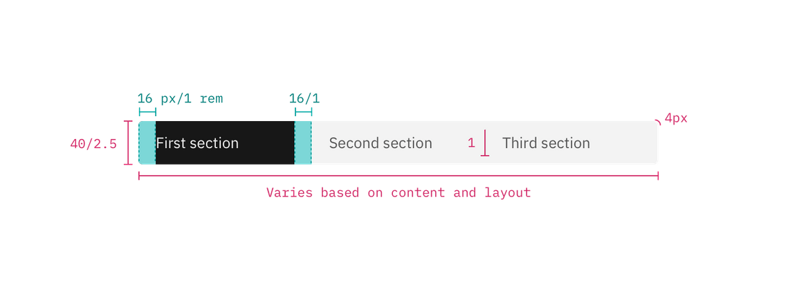
Example of a design spec
3. Create a Sketch symbol
Any new components or changes to existing components will also live in the Carbon Sketch kit and so we’ll need a Sketch symbol. Check out Sketch’s guide for creating a symbol.
This symbol can be contributed with the asset or enhancement, but must be added to the kit by one of its maintainers. To contribute a symbol, simply open an issue in the kit repo.
4. Provide usage documentation
If the contribution adds additional behavior or expands a component’s features, you’ll need to document them with usage guidance, which will go in the usage tab of the component page. Color and type tokens will live in the style tab.
See our production guidelines and the documentation guidelines for help documenting your work. Reading through existing component documentation on the site will help also.
5. Provide working code
The component or enhancement must be built in one of our supported frameworks (Vanilla, React, Vue, or Angular). See the contribution guidelines for the specific repo you intend to contribute to.