Tree view
Tree view is a navigable representation of a data structure. The parent and end nodes are purposely designed to makes displaying and navigating hierarchical data easier for your user.
Overview
Many products must display large sets of data that their users navigate to complete tasks. The tree view organizes this data in parent and child nodes that follow conventional behaviors of data trees and file browsers in operating systems.
When to use
Use the tree view to visualize and users to navigate up and down tree data structures. Compared to similar components like accordion, left nav, or data table, the tree view is better suited for navigating deeper hierarchical levels.
Navigating data
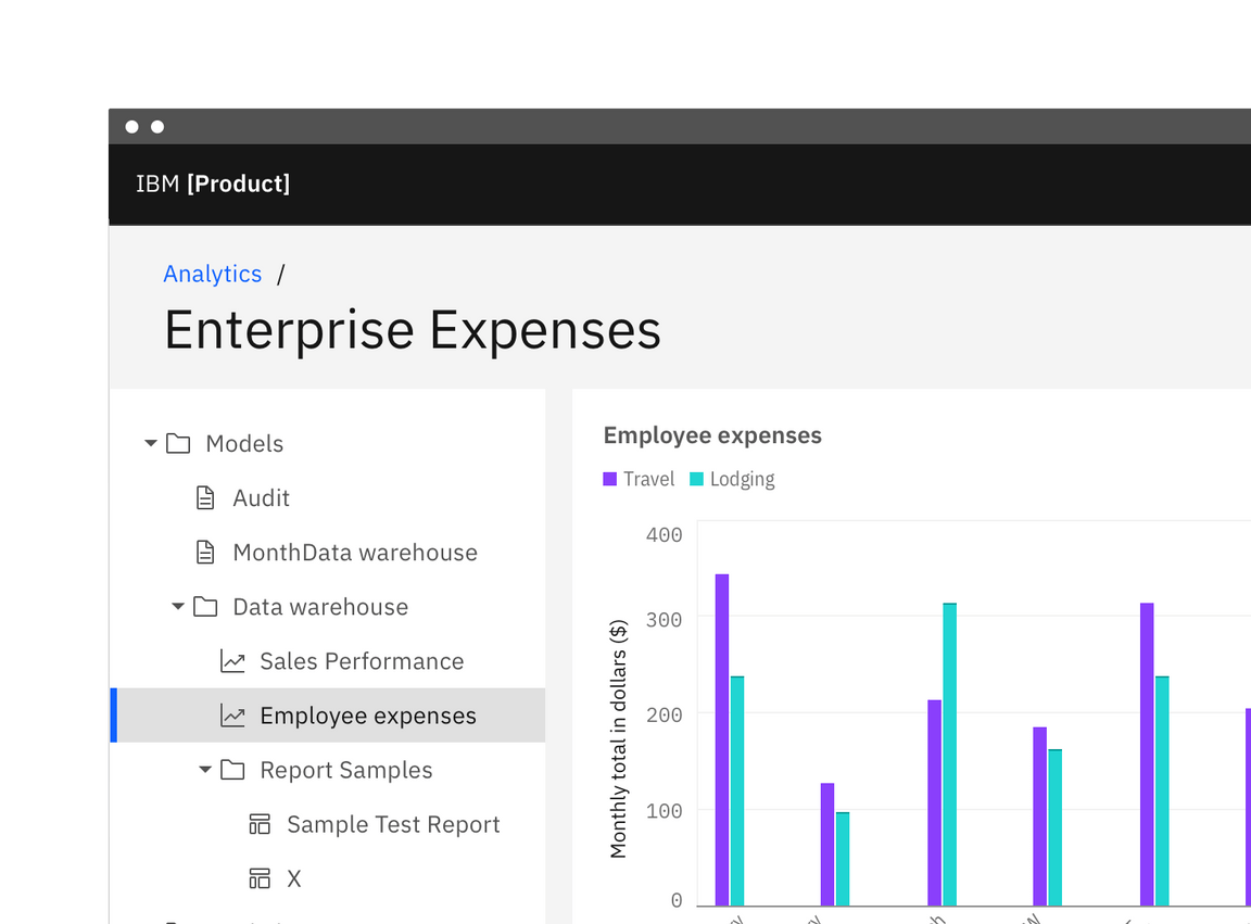
Characteristics like the ability to have multiple parent nodes open concurrently and nesting nodes several levels deep make the tree view better suited for navigating data structures and should not be used as the primary navigation in a product’s UI. Instead, use the UI Shell left panel for product navigation. A combination of the UI shell left panel and the breadcrumb component can support an information architecture several levels deep.

Do use the UI shell left panel and breadcrumbs for product navigation.

Do not use the tree view as the product's main navigation.
Do not use the tree view as a way to show and hide other UI elements or content. Aesthetics like the bolder selected state and indented nested elements of the tree view are intended to organize large and aid in navigating up and down data structures. Other components, like the accordion, are better suited for displaying different types of content.
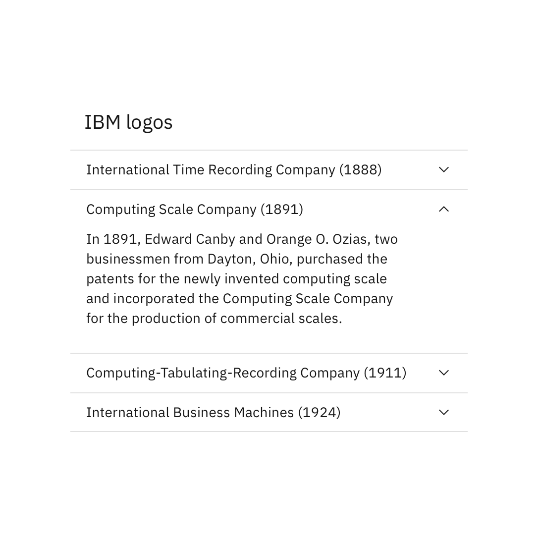
Do place content in the accordion component.
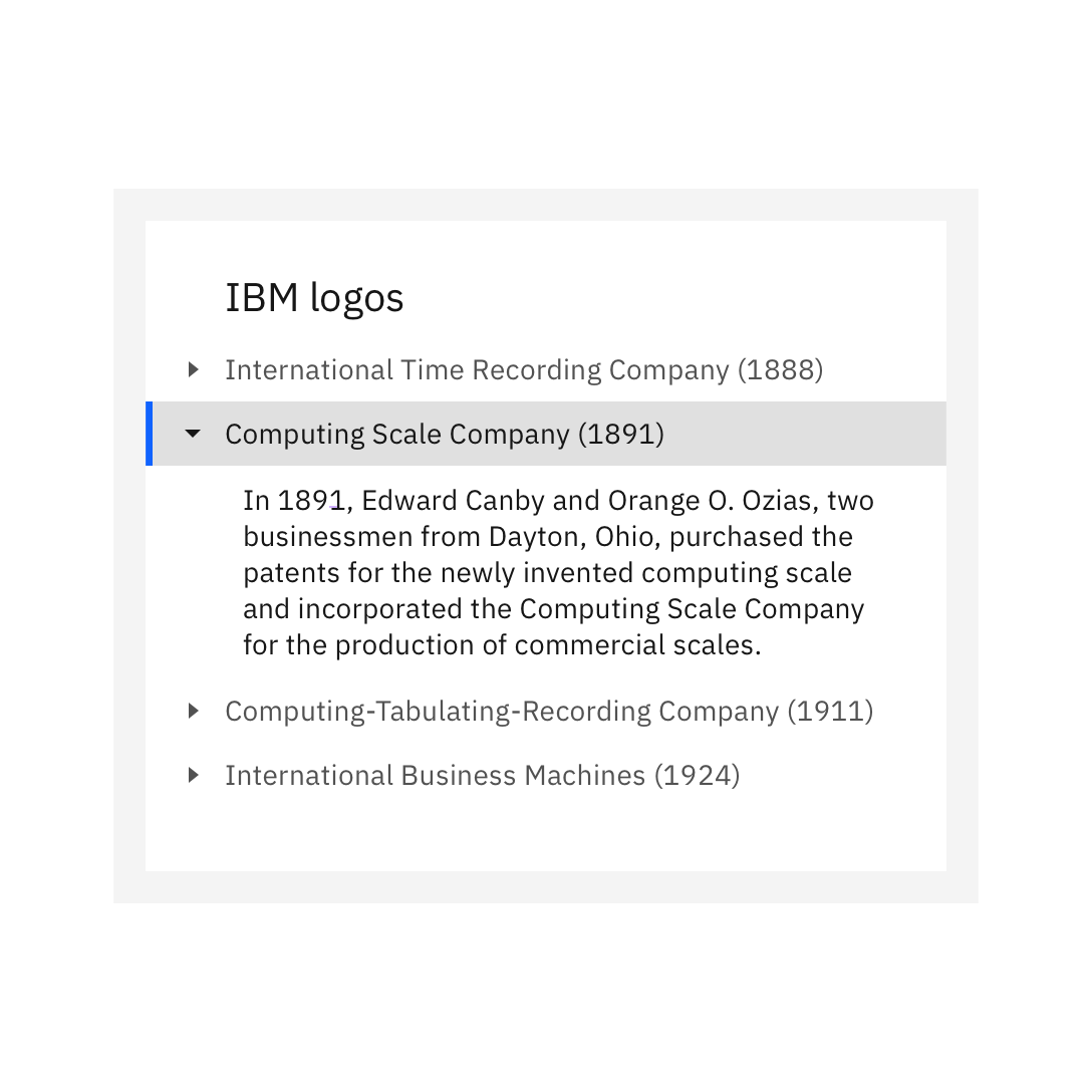
Do not place any element that is not a tree node in the tree view.
Tree view types
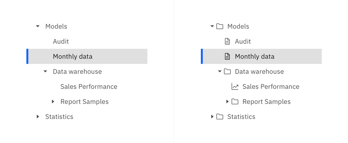
| Type | Purpose |
|---|---|
| Text only | Where the node type is unknown, not necessary to indicate, or the all nodes are the same type. |
| Text with icon | For indicating the node type. This is useful when the node type can be known in the data and if there could be different types of data displayed in the tree. |
Formatting
Anatomy
The tree view is composed of parent and children nodes that are purposely designed to nest and organize complex sets of data.
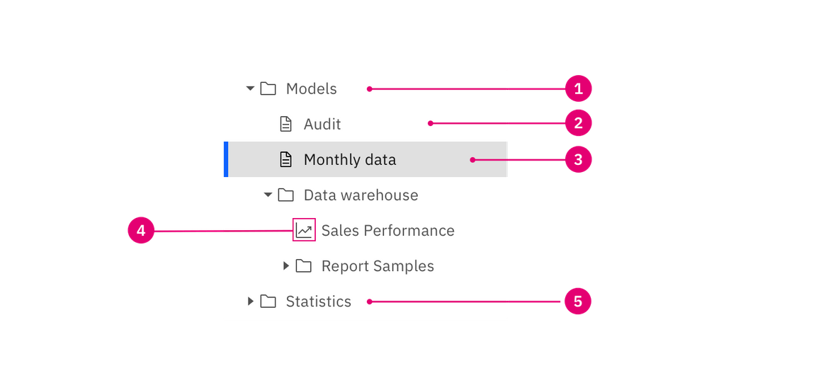
- Open parent node
- End node
- Selected node
- File type icon
- Closed parent node
Parent node
A parent node is a node that can be opened or closed to reveal the nested children nodes. These children nodes may be other parent nodes or end node. If the data requires it, a parent node could be selected independently of the click and expand behavior.
The parent node uses the caret icon to indicate its opened or closed state. Using the caret icon sets the tree view apart from the chevron used in the UI shell left nav and reduces the visual clutter when next to the file type icons. These differences aim to distinguish the tree view component from the UI shell left nav.
If the parent of a selected node is collapsed that parent should inherit the selected state so the user does not lose the context of what is selected.
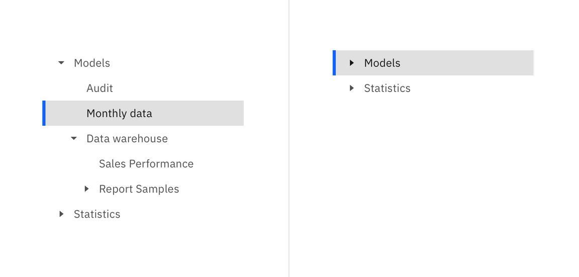
An example of the parent node inheriting the selected state when closed.
A folder is often used as a metaphor for the parent node and is represented with a folder icon. Make sure the folder is an appropriate metaphor for your data and to be consistent when picking an icon to represent all parent nodes in your tree view.
End node
An end node is any node that does not have nested children. These nodes can appear at any level of the hierarchy.
File type icon
This variant of the tree view can be used to indicate an extra level of information about the file or data type of the node. Do not mix the icon and non-icon nodes in a tree view. This can cause unexpected indentation of text and make the visual grouping of children nodes less obvious.
Placement
The tree view relies on type alignment to visually group nodes. Icons and carets in 16px columns to make the most efficient use of horizontal space in order to achieve that type alignment and grouping.
Type alignment is used to show grouping and nesting for tree views with or without icons.
Behavior
States
The parent and end nodes both share the same styles for the different states. The only difference being the addition of a caret for the parent node’s open and closed state.
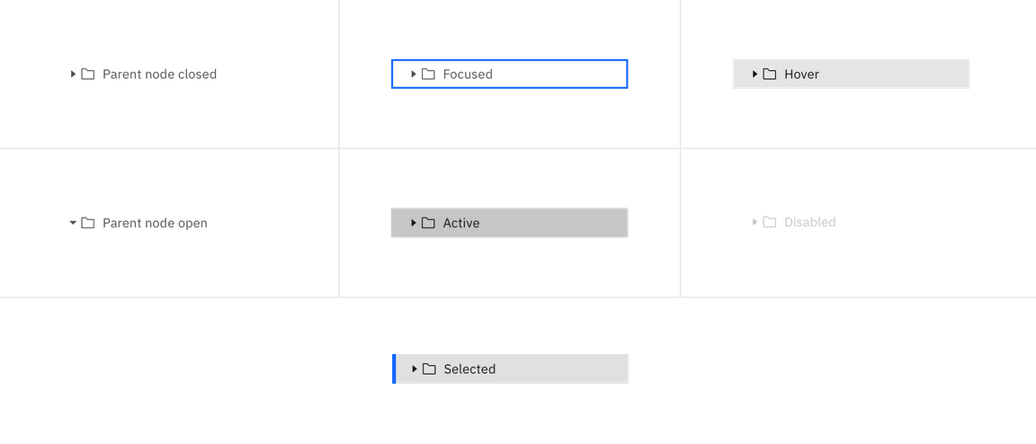
The hit area, background, and selected state of a node should extend to the full width of the tree view’s container. This gives every node in the tree view same size hit area and visual weight when selected.
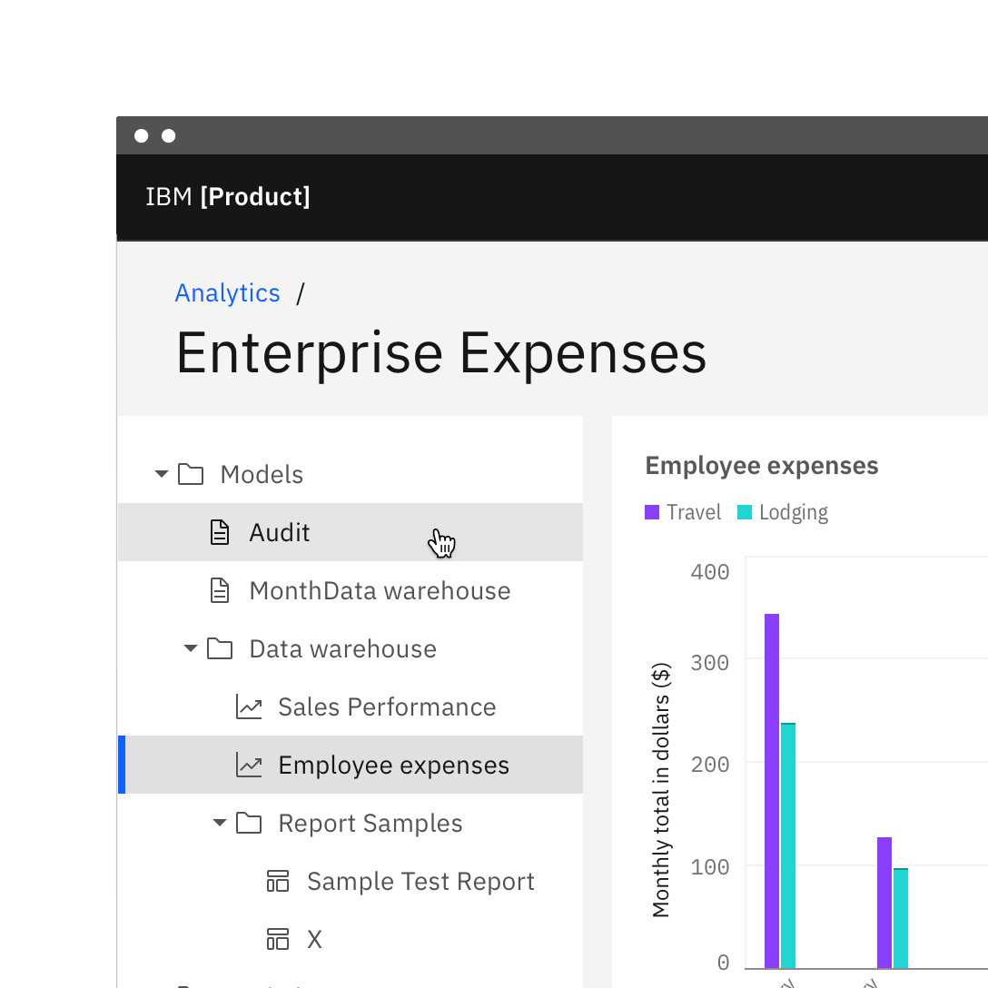
Do use the UI shell left panel and breadcrumbs for product navigation.
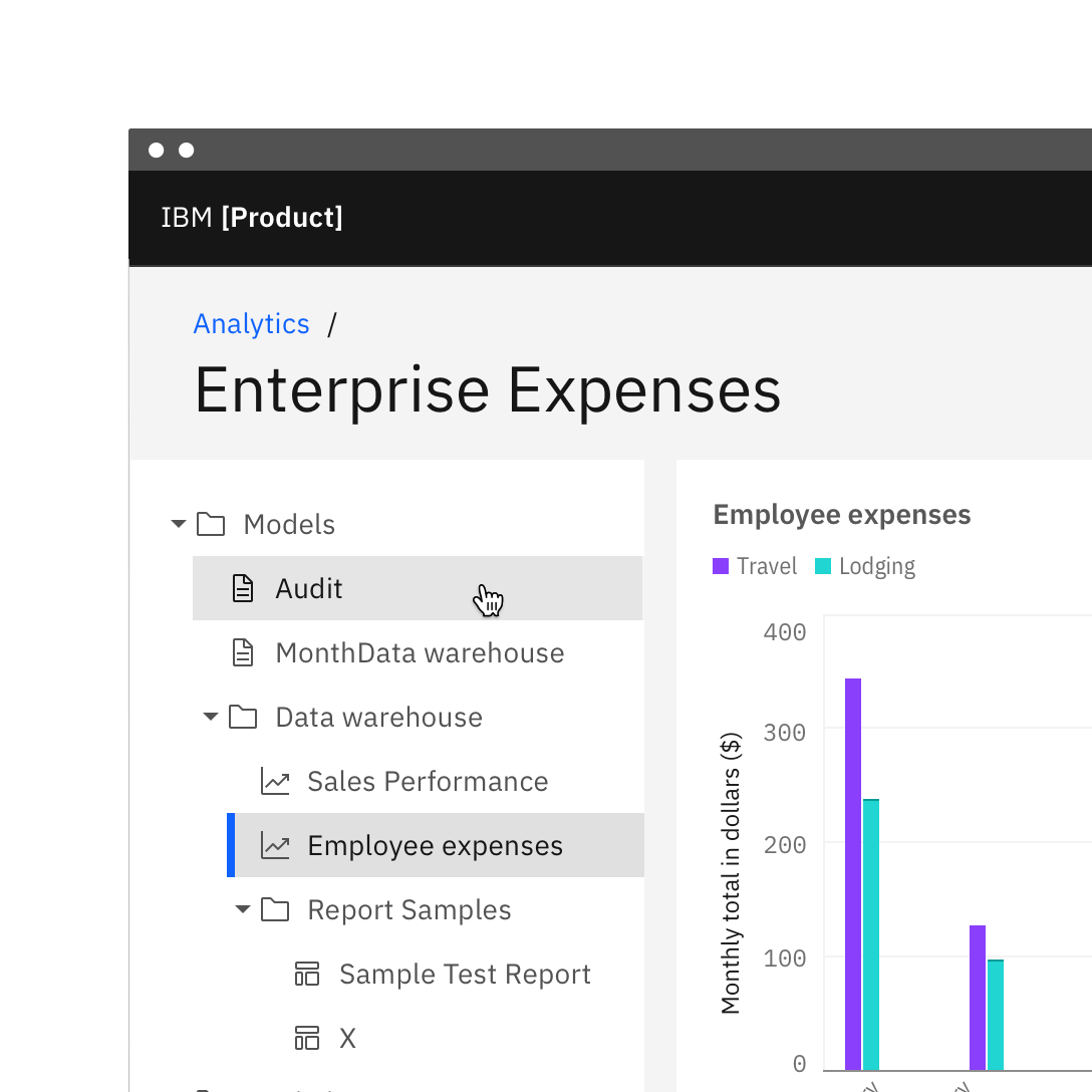
Do not use the tree view as the product's main navigation.
Modifiers
Node height
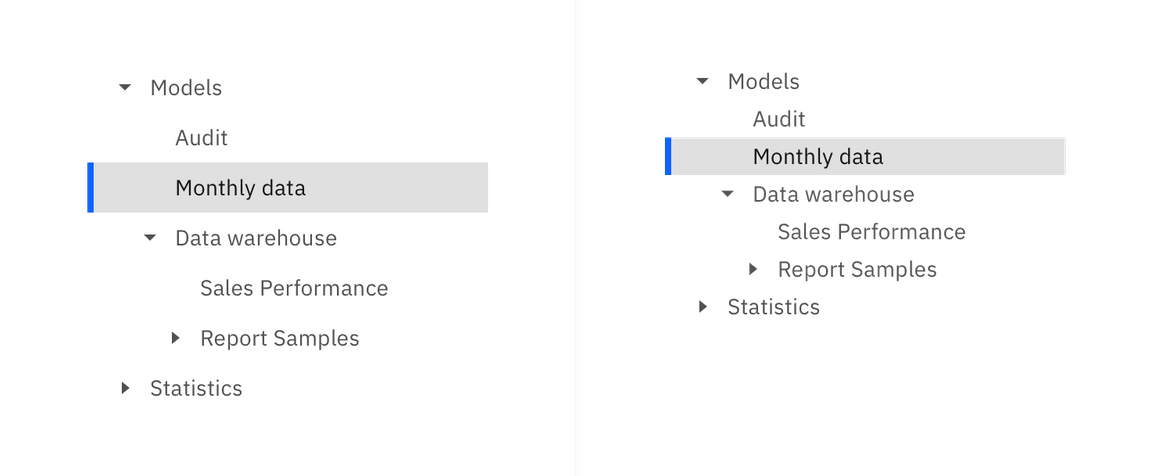
There are two node sizes: default, and small. Both text-only and icon and text nodes can be used in either of these sizes.
| Node size | Height (px/rem) | Use case |
|---|---|---|
| Default | 32 / 2 | For a tree view that uses a 32px row height and a similar geometry to the UI shell left nav. |
| Compact | 24 / 1.5 | A more compact version of the tree view that uses a 24px row height. This gives a more condensed view of the data when it is more important to show more nodes on the screen. |
